(n/a) Color Theory
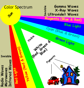
Color is a critical factor affecting image size, ultimate burden on bandwidth and visual appeal of your Web page. Color is a naturally occurring phenomenon caused by light. Light represents the visible portion of all the energy waves that occur in nature. Radio, microwave, infrared, ultraviolet, x-ray, and gamma waves are also forms of energy, but the waves are either too long or too short for the human eye to detect.
(03.06) RGB vs (CMYK)
Light waves consist of the colors red, green and blue, known as the RGB color space. These are primary colors because mixing any other colors will not produce them, but, when mixed, produce all of the other colors in the rainbow. What happens if you mix the RGB colors all together at full intensity? You perceive white light. Conversely, if you remove them all, you perceive black. Think of it like turning a light switch on and off.
(03.06) Primary colors
You can also think of primary colors as any three colors, that when mixed together produce white light. These colors, therefore, are also known as the additive primary colors. It is important to distinguish that the color sensations we experience are not a direct result of "seeing the light" -- but of seeing the light as it reflects off objects in our view.
The pigments that absorb the light of the additive primary colors are called subtractive primary colors, or pigment primaries. They are red, which absorbs green; yellow, which absorbs blue; and blue, which absorbs red. Thus, if a green light is thrown on a red pigment, the eye will perceive black. You can mix pigment primaries in varying amounts to match almost any hue. If your mix all three in about equal amounts, you will produce black. It is helpful to think of pigmentation as filters. A red filter will allow only the red light to pass through and will absorb all other colors, thus everything would look red through a red filter, such as the lenses in sunglasses.
]
When designing Web pages, many beginning designers are unaware of the differences between RGB and CMYK. It’s not just a simple matter of scanning printed material; the colors will not look the same since monitors display color using RGB.
Compare RGB and CMYK
Red Green Blue Cyan Magenta Yellow
Compare each of the colors in the table with the color swatches in your book on page 3.07.
What do you notice?
What conclusions can you reach?
(03.34) Color palettes
With an RGB spectrum of 16.7 million colors (256R x 256G x 256B) and early video technology only capable of displaying 256 of them there became a need to standardize which colors browsers should support. Called the Web-safe palette, the chosen colors would display the same on any platform and in any browser. Currently, there is raging debate as to whether the Web-safe palette is now passe since many designers believe very few people still use the limited video and that current browsers now support the full spectrum. While this may be true, it's difficult to know if the leading browsers agree on specific colors when they depart from the palette and when it comes to image colors, it's important to remember that the greater number of colors you use in an image results in a larger file. While video and browser technology may no longer be much of a limiting factor, bandwidth is, so it's still important to understand the Web-safe palette and how to use it when your design warrants it.
The Web-safe palette contains only six hues from each channel (0 percent, 20 percent, 40 percent, 60 percent, 80 percent, 100 percent), or 216 colors in total (6R x 6G x 6B). Browsers and image editors understand these colors only in terms of hexadecimal code. I don’t expect you to become a math whiz; however, you do need to become familiar with the six hexadecimal color values that make up the Web-safe palette: 00, 99, 66, 99, CC, FF. By combining these six values in each of the RGB channels, you’ll be choosing from the 216 colors that you know your browser understands.
The Websafe Palette (hover your mouse over each square and view the status bar)
As far as color choices, you should carefully consider whether or not to depart from the Web-safe palette to be sure browser colors look good together with your image color choices. The key to choosing effective color schemes has more to do with color relationships than with choosing a particular color within the spectrum. Understanding color terminology—including hue, value, and saturation—will help you choose effective colors that appeal to your audience.
The term hue refers to the actual color in the spectrum, such as red, green, or blue. Value, on the other hand, refers to the range from light to dark, such as #FF0000, which is the lightest value of red, or #330000, which is the darkest value of red without turning black.
Saturation refers to the intensity of the hue. Consider #FF0000 again, which is the color red at its lightest value but also at its greatest intensity. To reduce the intensity of red, you reduce its opacity by diluting it with white, or by adding equal amounts of green and blue. For example, #FFCCCC produces a muted red, which is red at its least amount of saturation.
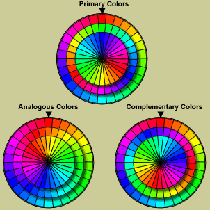
Now that you have an understanding of color concepts, you can choose your color scheme. One common strategy is to create an analogous relationship between colors, which you simply do by varying the values or saturation of the same hue. Alternatively, you can create a complementary relationship, which simply means choosing from complementary hues. The following screen shot illustrates the color wheel and how you can form analogous and complementary relationships that will appeal to your audience.
Readability issues
An unreadable page is simply put - poor design. If you run across a page you can't read, however, it's likely because the creator has no knowledge of color readability issues. The key to creating a readable page is understanding monitor gamma differences. Think of gamma as the definition of white light. Technically it refers to the strength of the electromagnetic field emitted by the energy source, in this case, the monitor. Different manufacturers and different platforms use different gamma calibration settings. To avoid readability problems, choose foreground and background colors that have sufficient value contrast. For example, avoid using #FF0000 on #0000FF (red on blue), using the same values in both channels. Your page will be readable on all monitors if you separate the values, such as #990000 on #0000FF (darker red on bright blue). If you have access to an image editor, check your color choices by converting them to gray scale. If the foreground disappears on the background in grayscale, you can be sure many surfers won't be able to read your page.


